Original track + pixel art
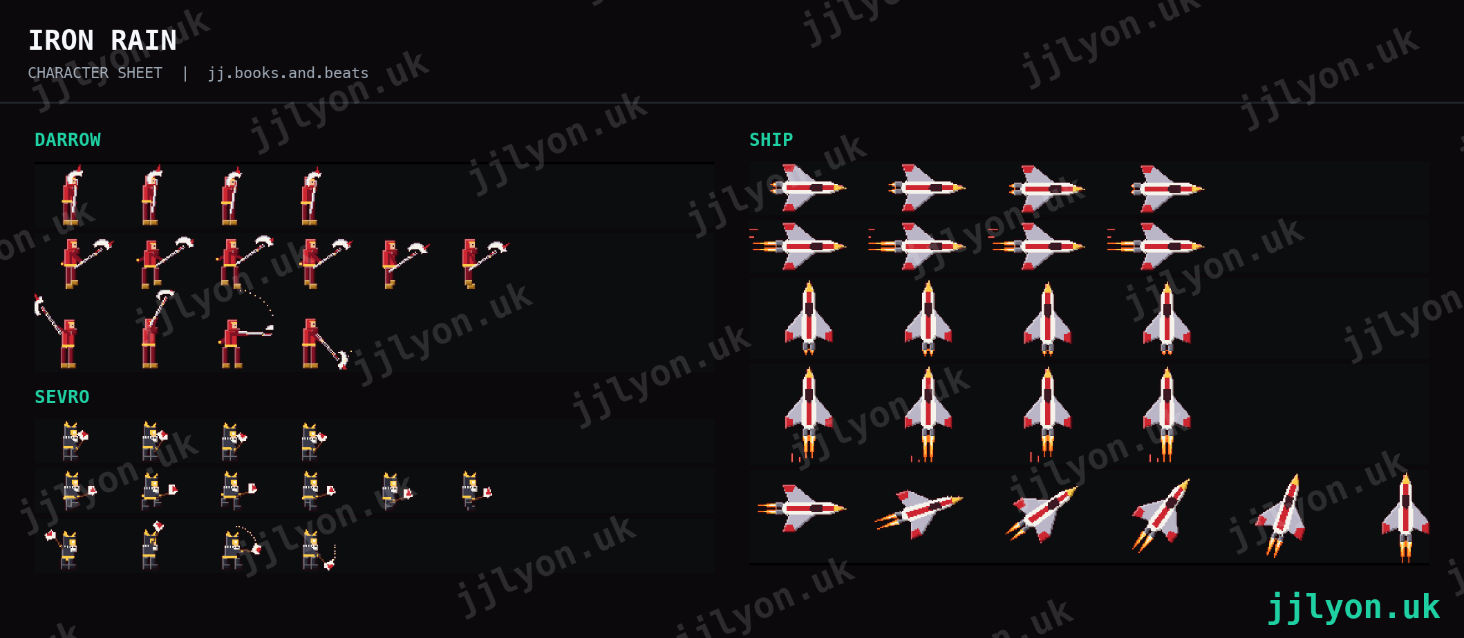
Iron Rain
An original track written in Ableton, with pixel-art characters and a side-scrolling scene drawn in LibreSprite and animated for the video.
Bookstagram & BookTok
I make 3D book renders, pixel-art videos, original music and carousels for the book community on Instagram and TikTok. Behind it sits years of marketing for audio software, music gear retail and B2B e-commerce. I help authors, publishers and creators stand out in a feed where every post is a cover.
From the feed
Each one is built from scratch: the track, the artwork, the animation and the edit.
Original track + pixel art
An original track written in Ableton, with pixel-art characters and a side-scrolling scene drawn in LibreSprite and animated for the video.
Beat + pixel video
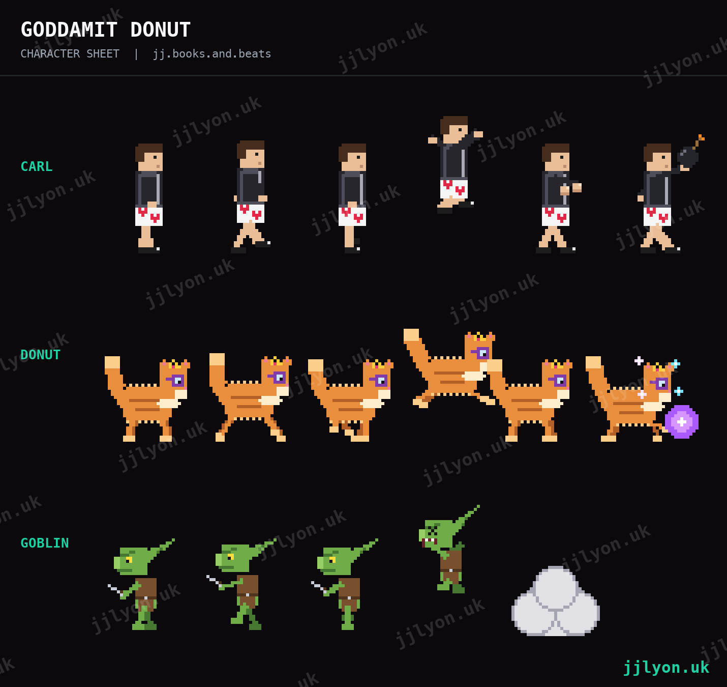
A Dungeon Crawler Carl inspired beat. The video is a screen recording of the Ableton project with pixel-art characters, titles and a floor built in After Effects.
Remix + book community
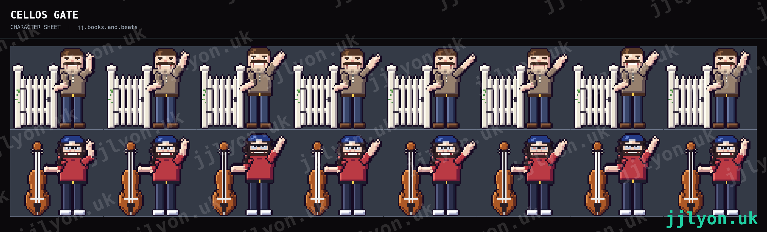
A remix made for the book community, cut to the music and shared with the readers it was made for.
Graphics
Static and designed work for the feed. Every piece follows the same brand system, so a post is recognisable before the name is read.
Trading cards
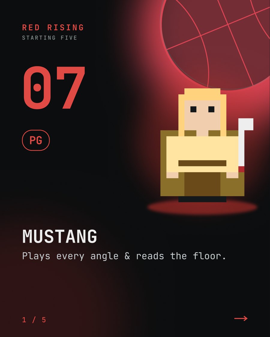
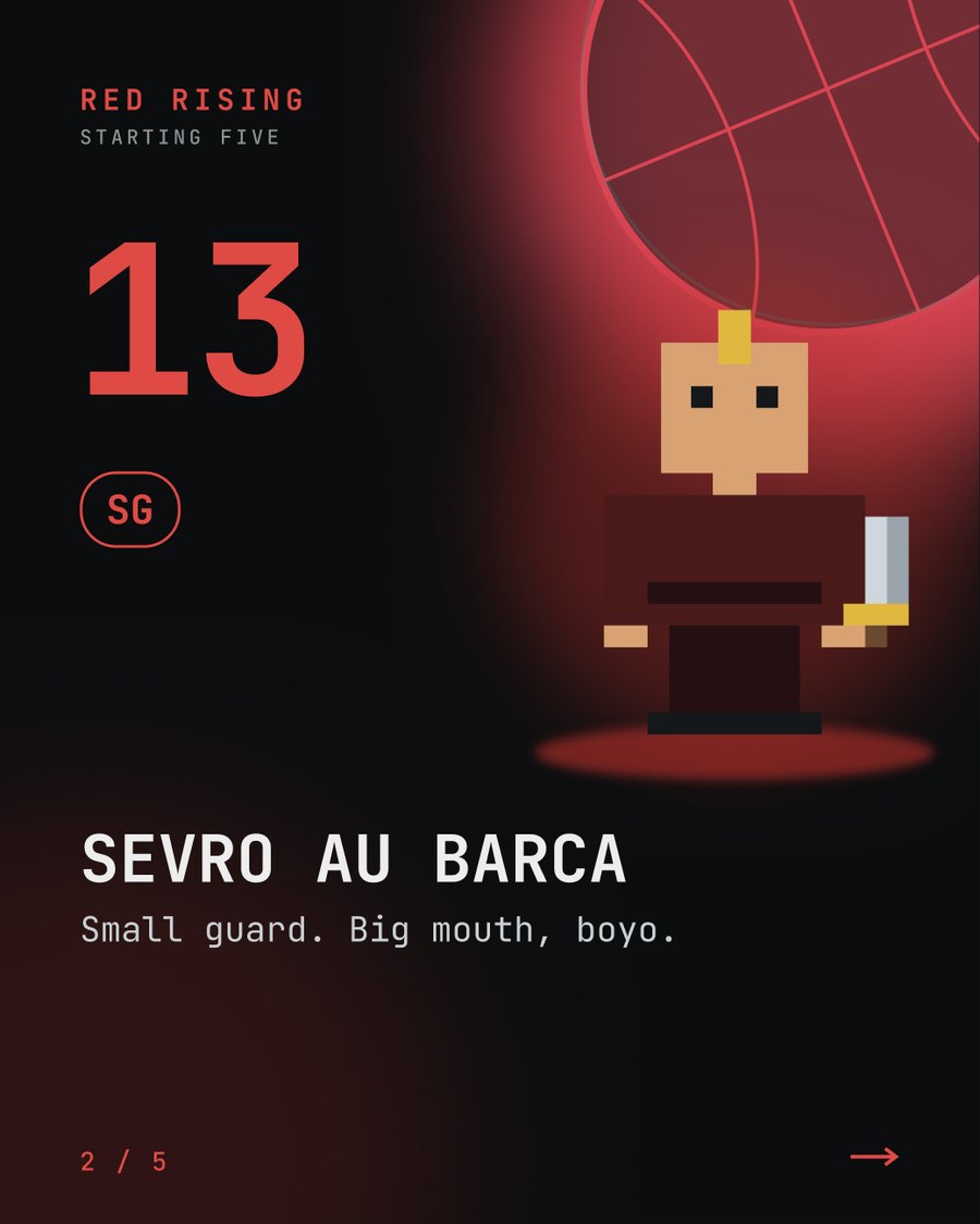
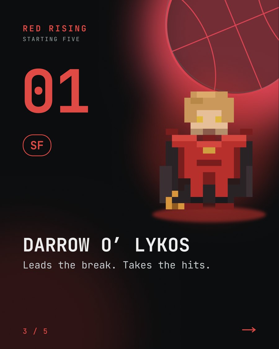
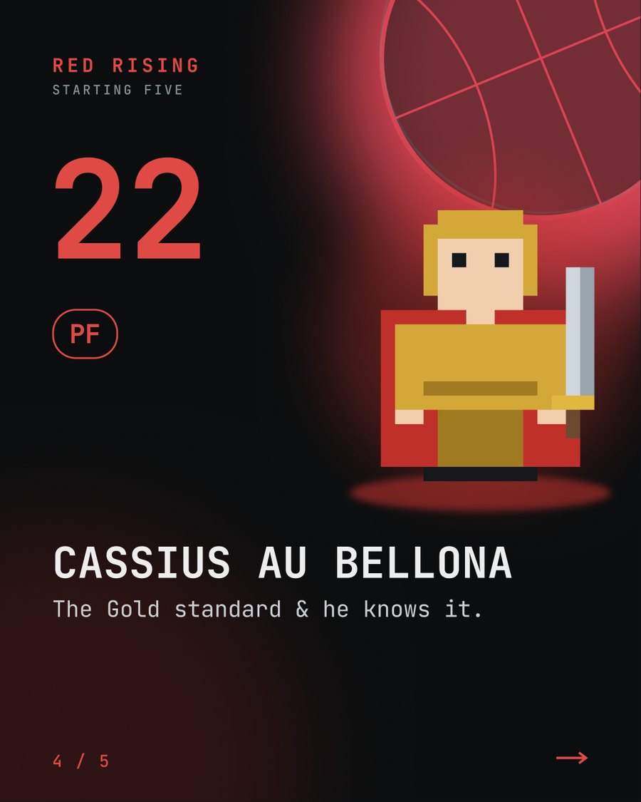
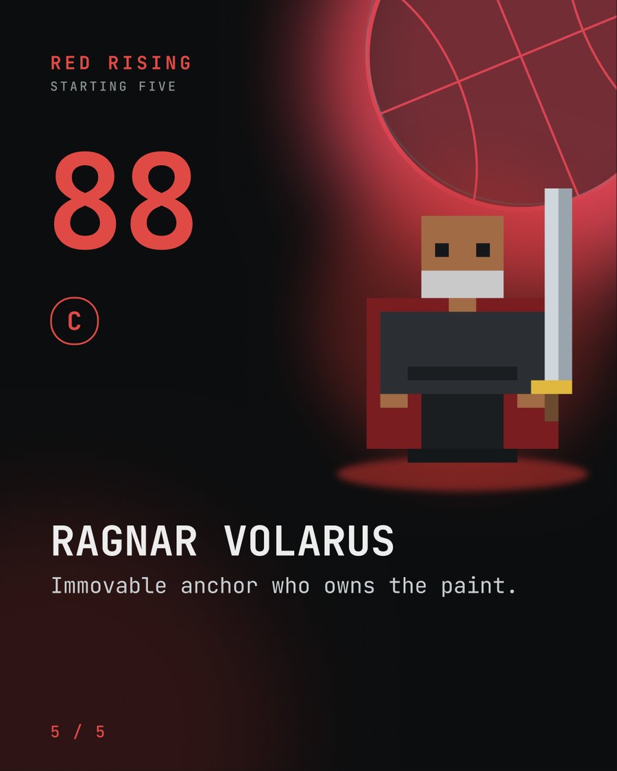
Sci-fi and fantasy characters as collectible cards, shiny pulls included. This set is Red Rising.
Carousel
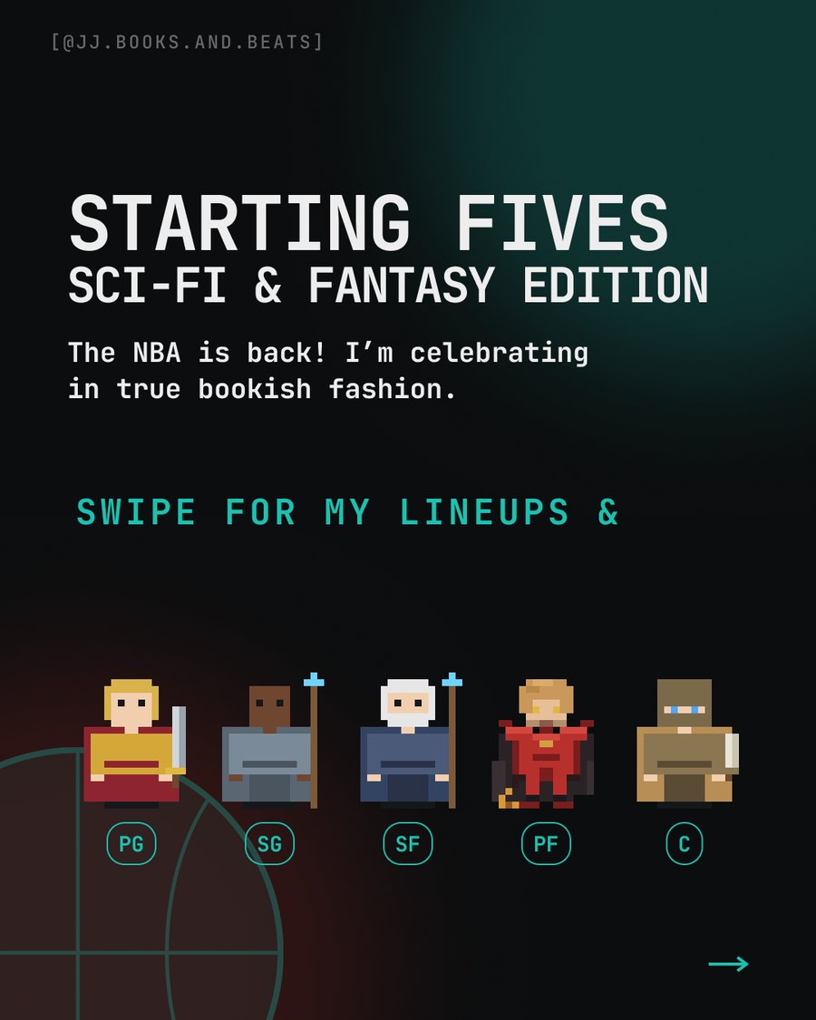
A basketball-style lineup from Red Rising: five characters, one position each, swipe through the starting five.
List reel
A list of red-covered books, with a question to the comments: what have you got against red books?
Reel
Four books on the list for the month, and a question for the readers: what is on yours?
Carousel
My 34 favourite books from the last year, posted on my 34th birthday.
The craft
Books modelled and rendered in Blender, then composited over real footage in After Effects and Premiere. Floating covers, floors tiled with books, renders matched to the lighting of the room.
Sprites drawn by hand in LibreSprite and animated into 16-bit scenes. Fire, lightning, bats and starfields are written in code and rendered as transparent sequences for the edit.
Beats and songs produced in Ableton, with sound design built from synths and plugin chains. Audio and picture are cut to the same tempo, so titles land on the beat.
Reviews and storytelling-theory breakdowns in a consistent visual style, designed in Figma and written to earn saves and comments.
Content calendars, hooks, email and landing pages, plus measurement. I have scaled an email list past 320k and a following past 54k at an audio software company, and a book launch gets the same plan: a clear audience, a clear offer, and a way to count what worked.
I read and review books on bookstagram myself, so I know what the community shares, what it ignores and what a reader will actually save.
Brand guidelines
One look across every carousel, card and reel. These are the rules I work to, and the reasoning for each, which is the same process I bring to a client's brand.
#0B0D0EBase for every slide#14181ACards and raised areas#19C2B0The one brand colour#24E5C8 to #009EA8Gradient on accent words#0E968ALight behind images#8A9396Secondary text and labels#EDEDEDBody and headlinesJetBrains Mono
BIG ALL-CAPS STATEMENT
Switzer
Paragraphs and review text read cleanly at small sizes on a phone screen.
Work with me
A launch video, a character card set or a trailer-style reel for your book, made to be shared by readers.
Repeatable content formats for a list of titles, with art, music and copy handled together.
Custom effects, intros and a visual identity for your own bookstagram or BookTok channel.
Tell me about the book, the audience and the date. I'll reply with ideas and a quote.
Start a project →